3D hero mark
A bold “WE ARE JUST IS” opening with a 3D mark that sets the agency’s voice.
(Case study) — 03 / 10
JUST IS is a digital agency in Baku — branding, UI/UX design, web and mobile development, one team from design to deploy. I lead its front-end team; this is the agency’s own site.
(Scope)
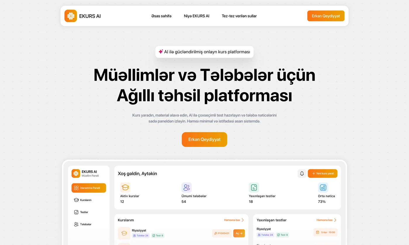
An agency site has to prove the work before anyone reads a word. It needed to explain four services — brand identity, UI/UX, web & app development and digital strategy — and still feel like a product, not a brochure.
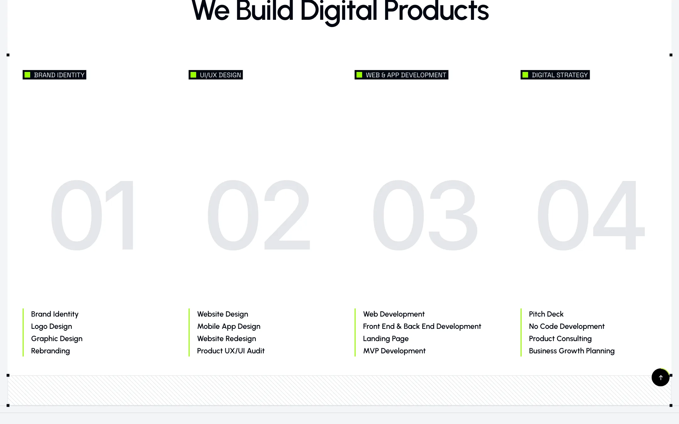
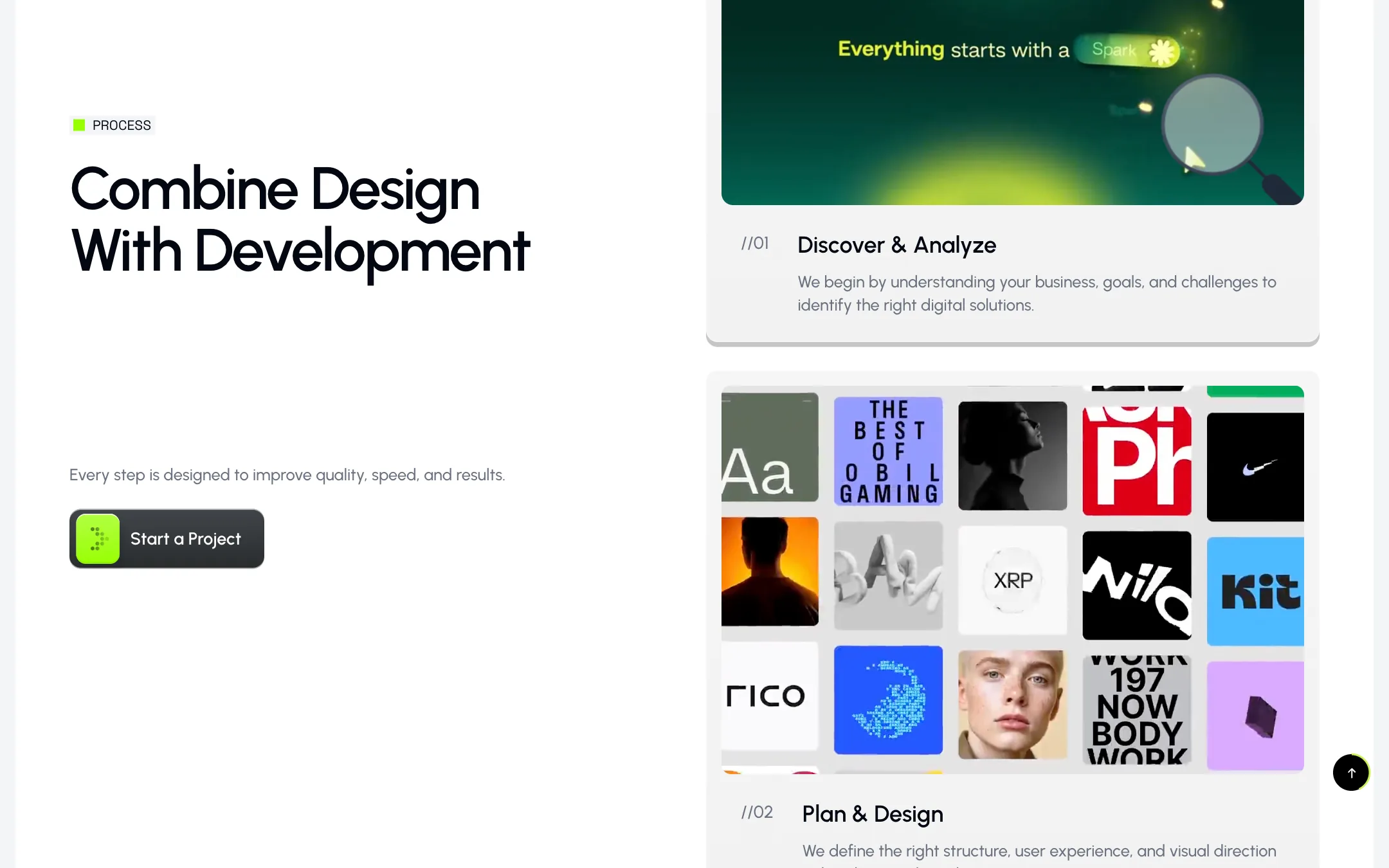
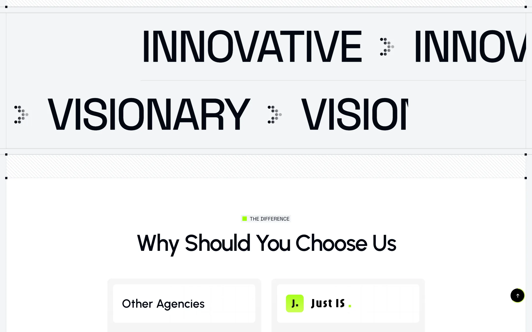
One long page that moves: a bold “WE ARE JUST IS” hero with a 3D mark, numbered service columns, a featured case (Ekurs AI), a four-step process with small looping videos, kinetic marquees and a direct “Other agencies vs JUST IS” comparison.
Every call to action leads to the same place — a booked call — so the page always has one job.
Keeping a motion-heavy page fast and calm: videos only play where they matter, the grid stays visible as a design element, and the same rhythm holds from a wide desktop down to a phone.
(Key features)
A bold “WE ARE JUST IS” opening with a 3D mark that sets the agency’s voice.
Brand identity, UI/UX, web & app development and digital strategy in numbered columns.
Four steps, each with a small looping video instead of a stock icon.
An honest “Other agencies vs JUST IS” table that does the selling.
(Full pages) — scroll to read them

(Mobile) — layouts on small screens




(Stack) — and why
The marketing team edits content without a deploy.
Scroll and hover motion built into components, not bolted on.
Cases and services managed as collections.
(Summary)
The agency’s own site is its first case study — design and development from one team, showing exactly what that means.